P22 Type Foundry and The Hamilton Wood Type Museum have announced the newest addition to the Hamilton Wood Type Legacy Project: Brylski by Nick Sherman, named for retired wood type cutter Norb Brylski and designed to be cut as wood type at the museum in Two Rivers, WI.


It incorporates several themes that were common in 19th-century type design, including bifurcated Tuscan serifs with angled mansard-style sides, heavy weight placement at the top and bottom of letters (traditionally referred to as French or Italian/Italienne, regardless of any actual relation to those countries), and an extended overall width. I asked Nick Sherman to give us more detailed information.

Georgie Brylski Liesch, daughter of Norbert Brylski, was trained by her father and cuts type
commercially for the Hamilton Wood Type & Printing Museum.

Hamilton Wood Type’s pantographs date from the early days of the company, c. 1892. Pantographs can
be adjusted to cut type at varying levels of reduction. Originally driven by electric motors, Hamilton’s
routers are now pneumatic, rotating at 50,000 revolutions per minute.

The templates used for cutting wood type were originally made by mounting thinly cut wood veneer on
plywood. When working with digital files, the museum relies on CNC routed templates.
What inspired this “Italian-style” typeface?
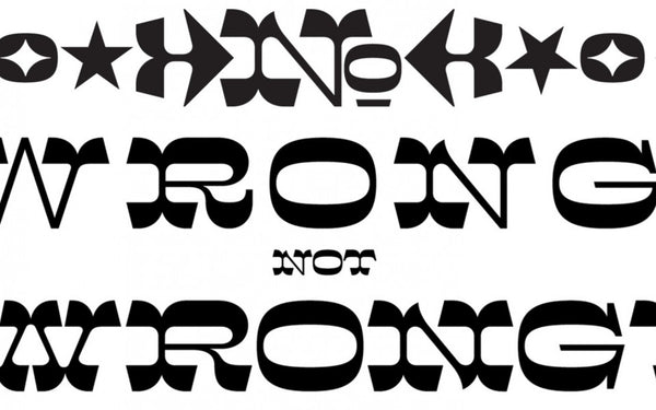
Before I talk about the inspiration, I should address the term Italian. With its exaggerated horizontal stress, Brylski can be broadly grouped with other typefaces that are referred to as Italian (or Italienne), but I generally avoid that term since it isn’t particularly accurate or descriptive. The first “Italian” typeface came from Caslon—a British foundry—and though some have speculated its inspiration came from Italian calligraphic styles, it seems more likely the name was simply following a trend at the time for naming exotic type styles after foreign locations.
Additionally, the original “Italian” type styles have a slightly different design logic than Brylski. Caslon’s Italian shows a very literal approach to reversing stroke weight, so thicks become thin and thins become thick. The effect appears similar in Brylski, but the logic is more about adding weight at the top and bottom of glyphs than it is about total weight reversal: If you mask off the top and bottom 20% of Brylski, the shapes in between just look like a wide slab-serif typeface with fairly even stroke weight (see illustration below). In this sense, Brylski has just as much in common with “French” typefaces like French Clarendon or French Antique—though the “French” term is equally problematic.

The inspiration for Brylski came from a variety of old-fashioned typefaces like Aldine Expanded, Wm. H. Page & Co’s No. 121, and most notably a design I first saw in a book of circus alphabets compiled by the late, great Dan X. Solo. Solo referred to the design as Midway Ornate but couldn’t recall the original name or source when I asked him, and I still have yet to find any more information on its history. But Brylski isn’t a strict revival of that design, instead adapting concepts from several historic themes for its own new design.
As part of the Hamilton Legacy Project, where does it fit into the history of type?
Because Brylski is intended to exist in both digital and wood type forms, I decided to embrace the physical limitations that were historically imposed on wood type, designing around simplifications to streamline the production and use of the wood type.
For example: Unlike most digital or metal type, wood type historically has minimal sidebearing space built in around each glyph. Brylski adopts this approach, with adjustments to minimize uneven overall texture. Similarly, consistent with historical wood type, round characters like O and G don’t feature optical overshoot corrections. Also, Brylski’s glyph widths and kerning values are set with a specific font size in mind, limited to half-pica increments at the intended physical size for simplified production and letterpress composition.
Who is Brylski?
Brylski is named for Norb Brylski, who worked in the Hamilton wood type factory when the company was still producing wood type as part of its normal product line. Norb is retired now but volunteers at the Hamilton Wood Type & Printing Museum, where he taught me firsthand about the process of manufacturing wood type with traditional methods. He’s a really charming guy with a classic American-Midwest demeanor, from his accent to his sense of humor and general no-nonsense approach to work and life.
How do you expect it to be used?
The design of Brylski is, not surprisingly, meant for the kinds of typography where wood type is most commonly used: large sizes, a few words at a time, for headlines or other display settings. Norb summarized it pretty well when Hamilton museum director Jim Moran asked what he thought of the typeface in a recent interview: “It’s more for a headline—possibly a short one—because it’s so spread out, so extended. Extended, that’s the word.”
Do you foresee larger revivals in these 19th-century-era typefaces?
I’d say there’s been a fairly consistent interest in ornamented 19th-century–style type since a wave of designers embraced it in the mid-20th century, perhaps sparked by the writing of Nicolete Gray and Rob Roy Kelly, and made easily available from companies like Solotype, the Morgan Press, TJ Lyons Press, and Photo-Lettering Inc. In other words: Don’t call it a comeback, it’s been here for years!
With that said, I have noticed a shift in the ways 19th-century type is being revived. Most 20th-century typography that referenced the 19th century did so by using old typefaces in new ways. In the 21st century there seems to be more innovation happening with the design of the typefaces themselves.
A perfect example of this is with the recent work from the Pyte Foundry, which takes already-weird themes from 19th-century type design and turns the weirdness up to 11, with refreshingly original results. There are also designers like David Jonathan Ross who find inspiration from 19th-century ideas, like reversed stress, and apply them to new typefaces in a range of intensity from subtle to very obvious. These designers are following a path of revival that Matthew Carter promotes when he says: “Reviving should be more than mere resuscitation. It means adding something new to the old.”
In the modern design landscape where many brands opt for safe, minimal and expected typographic styles, I don’t know if 19th-century type will become particularly popular anytime soon. But in the meantime, any designer who wants to make unique and interesting work has a great opportunity to stand out by embracing unusual ideas from ornamented typefaces that were common in the 1800s.

Designer Nick Sherman (left) conferring with Hamilton retiree
Norbert Brylski at the original Hamilton factory in 2011.
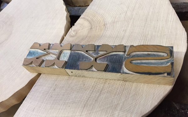
Early test-cuttings of the letterforms are shown alongside slabs of Rock Maple
from the museum’s collection.
The digital version of Brylski, along with all other HWT fonts, is available through P22’s Hamilton Wood Type Collection, with proceeds of sales supporting Hamilton Wood Type & Printing Museum’s ongoing mission of preservation and education of printing heritage and engaging with contemporary designers.